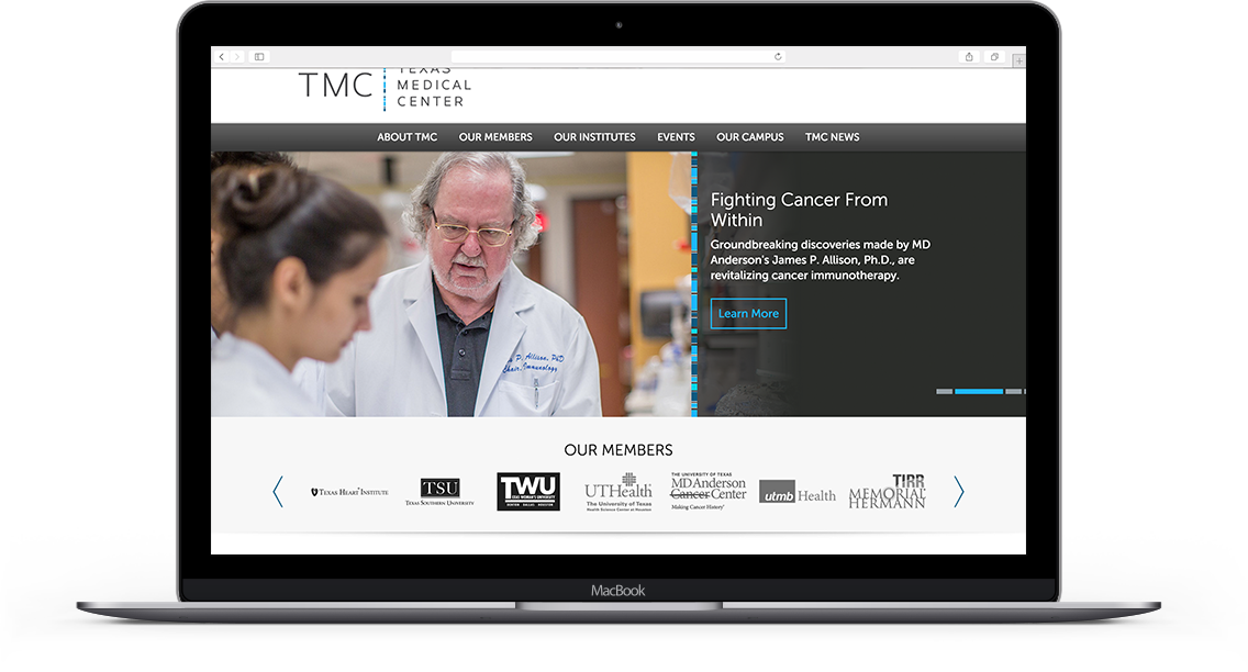
Texas Medical Center (TMC) comprises 54 renowned member institutions—making it the largest medical complex in the world.
Since 1945, TMC has pioneered hundreds of medical innovations bordering on the impossible. Today, many of these advancements continue to change people’s lives.
However, misconceptions about Texas Medical Center led many people to believe it was simply a business district, or worse, a parking facility. TMC wanted to build a new reputation, one of innovation and cross-institutional collaboration. Together, TMC and a|muse set out to position it as the world’s leader in patient care, research, education, and prevention—in just seven weeks.
The Challenge
TMC is a world-class life sciences destination, but its website and communications were outdated. It had over five different websites with varying logos and messaging, which confused end users and diluted its brand.
We decided on a complete brand overhaul—including a new identity, voice, and vision—to inspire and educate employees, patients, and visitors the world over. The new brand would also position Texas Medical Center, and the City of Houston, as a world-leading life science cluster.
Agency: Amuse Digital
Role: Art Director, Lead Designer
This has been one of the biggest projects I have worked on, not only because of the importance of this organization but because of the scale of it and the team size I was leading. By the time, this was one of the first projects the agency was working on, and on top of taking care of the project needs, I was also putting the team together as the project was evolving.
Brand Identity
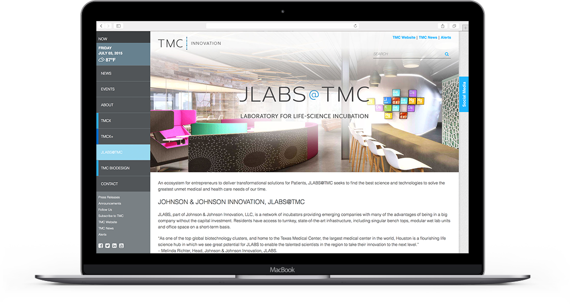
For the new brand, I wanted to evoke science, technology and innovation. The new logo features a “pipe” inspired by human chromosome maps, which unites the whole name of the organization with its abbreviated form. Utilizing innovative, timeless, modern typography, and employing use of blue tones as brand colors allowed for the creation of a fashionably modern, smart, and elegant logo that is unmistakably TMC.
TMC Sub-brands
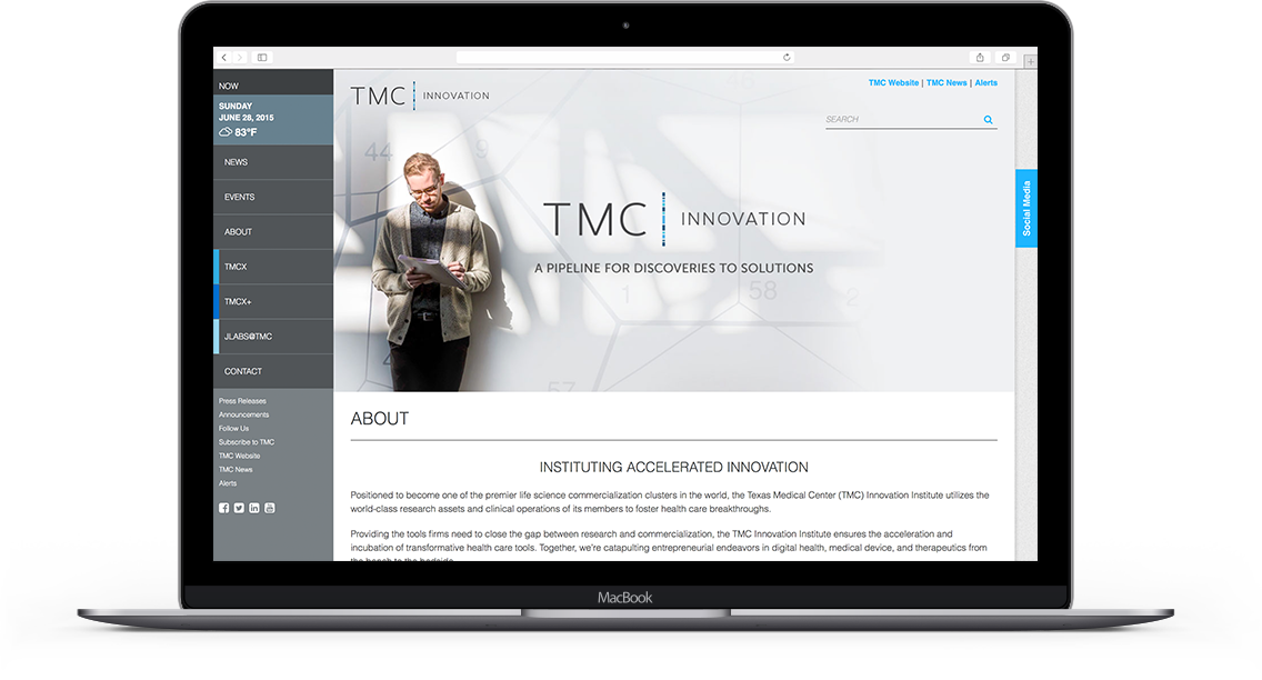
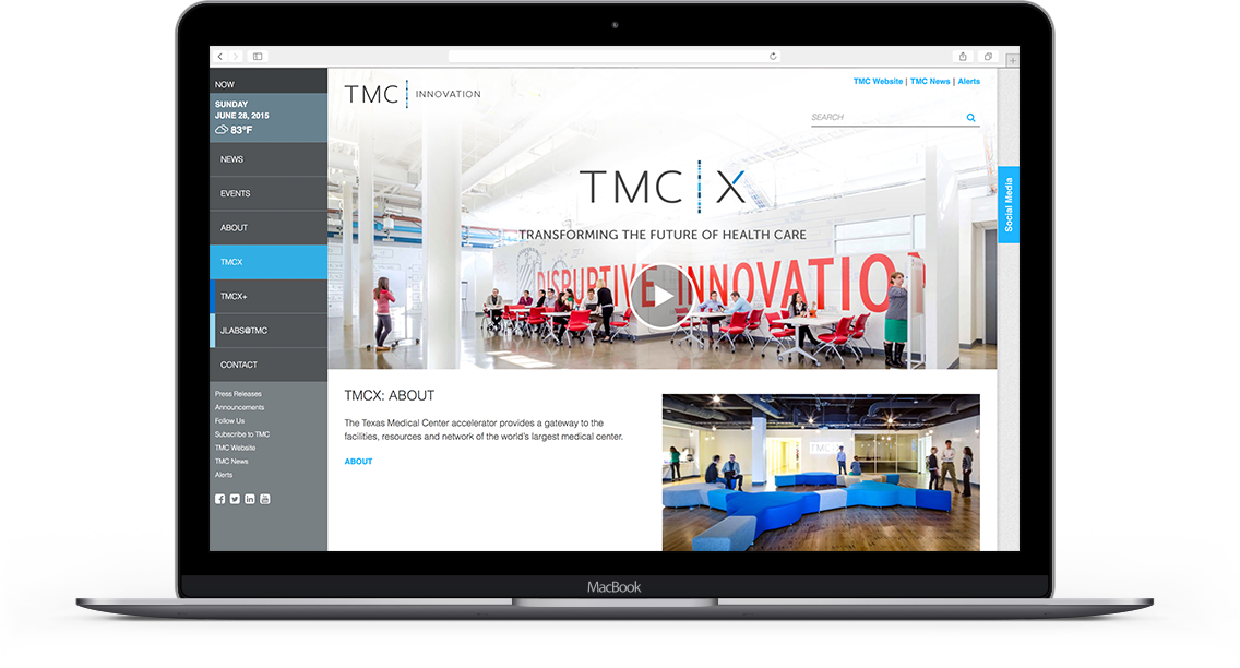
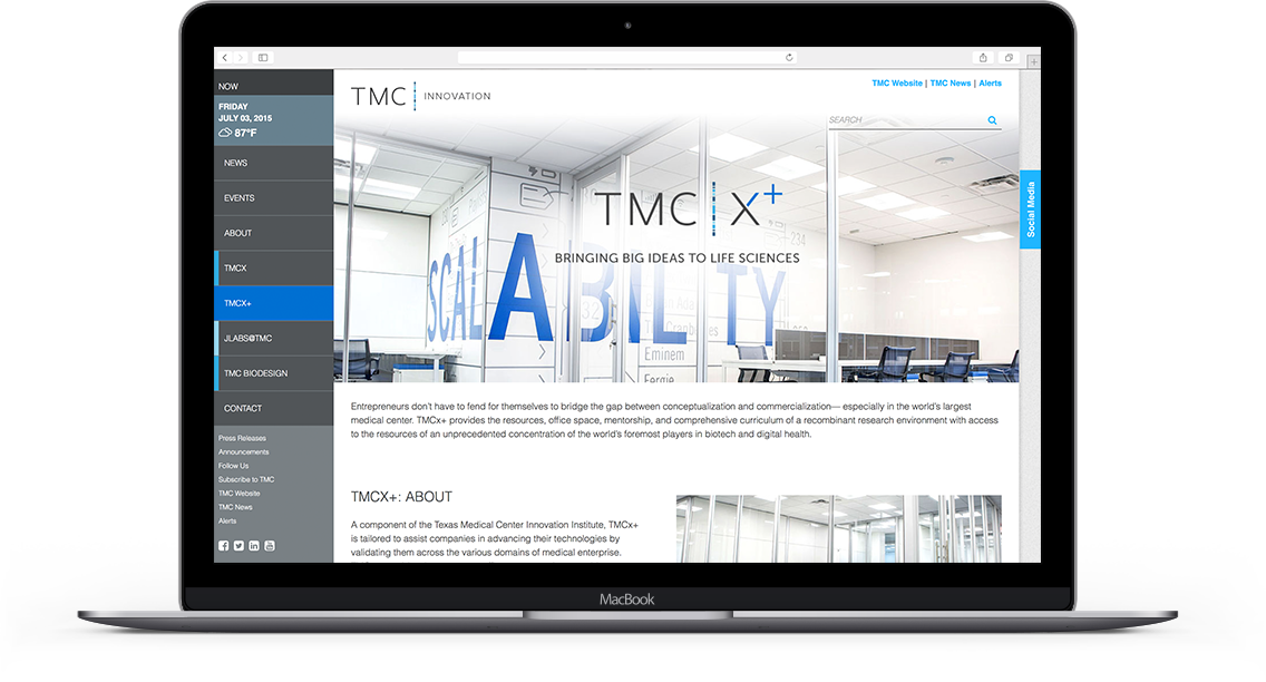
Since TMC was to develop many sub-entities, a design had to be considered that would express the hierarchy of institutions. The letters “TMC” would clearly denote the Texas Medical Center as the umbrella institution and the content following the pipe would designate the particular institution. This way, an entire suite of future sub-brands could be developed to support the TMC main brand.
After the re-brand, organic traffic helped boost page views by 36%. Multi-page engagement increased by 24% and time on site increased by 27%. Repeated visits increased by 63%.
The Implementation
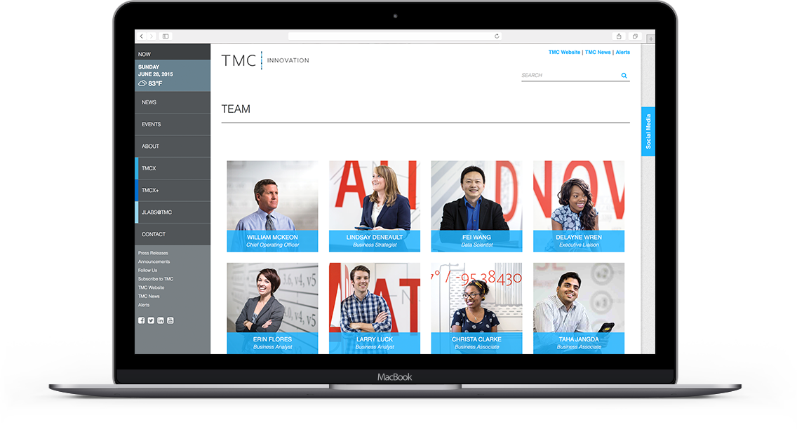
Texas Medical Center’s clean look and unified web presence marks the beginning of a new era in health sciences. We worked closely with TMC to re-brand itself and create a beautiful, user-first experience across platforms. The website was a huge undertaking. We created a new brand identity and consolidated five separate websites.
The responsive design allows users to consume content across nearly any device. Since the new site launched, mobile traffic grew by 57%, page views increased 61% and time on site increased by 25%—bringing mobile usage to record highs.


