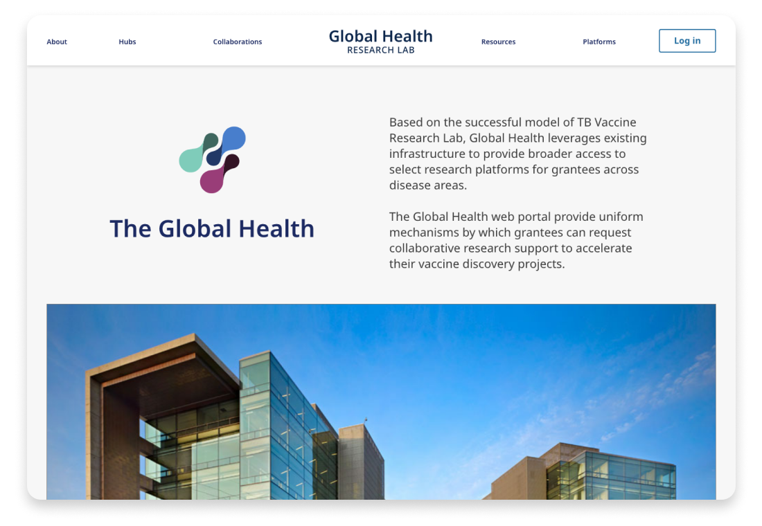
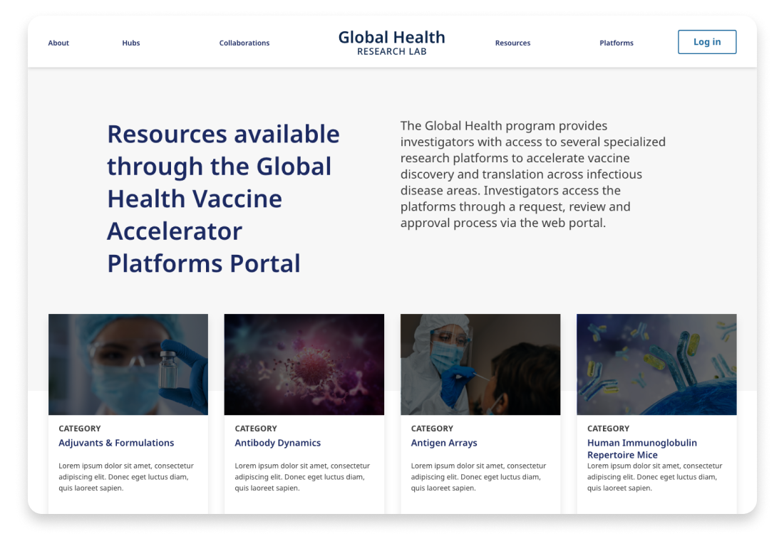
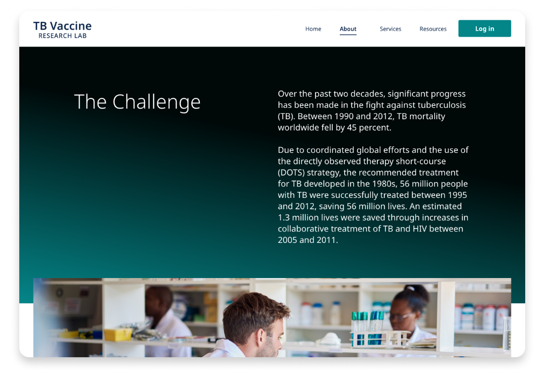
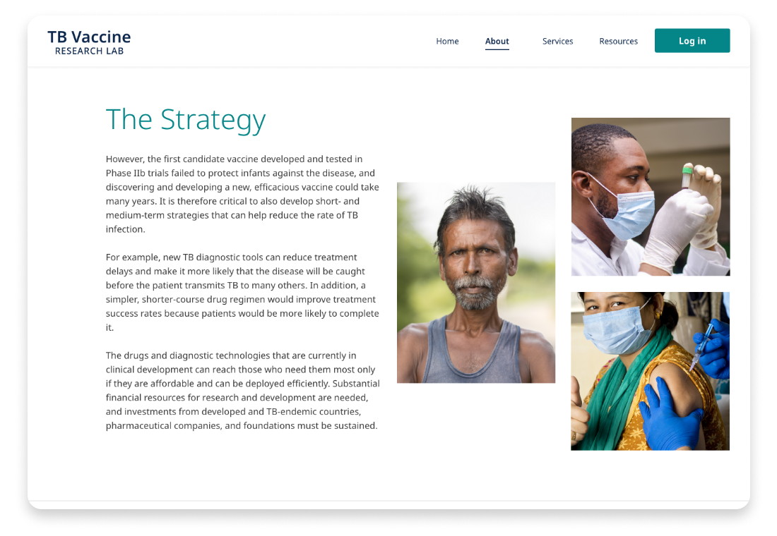
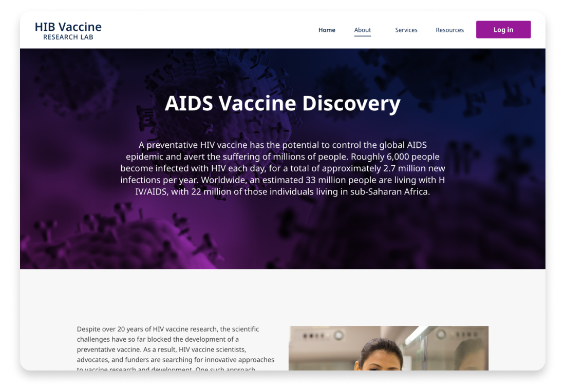
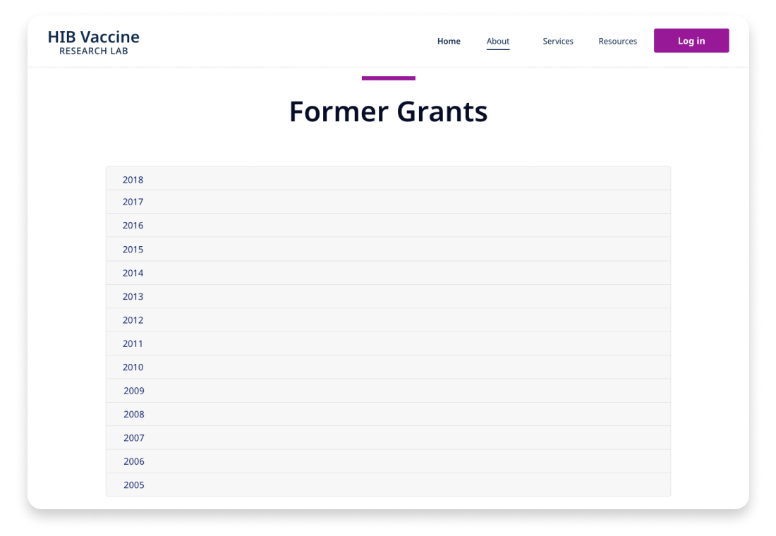
In an effort to continue the research and development of vaccines for TB and HIV, one of the biggest and most important non-profit organization of the world, needed to update their online presence by creating an experience with new methods of communication for its scientists as well as a roadmap for longevity. To keep a full and refreshed experience, we also work on the re-branding of their three research lab organizations.
3 Brands
3 Public websites
3 Internal portals
The challenge wasn’t easy, in only three months, the goal was to re-brand, create a new digital strategy and re-design three different public websites and 3 different internal portals for scientist communication.
As the Visual Design Manager for the project, my responsibilities included; re-branding, UI and visual design implementation, and overseeing the work of the UX and development team.
The Strategy
After reviewing the research, the existing website analytics, and the short timeline, my strategy was to create a templatized experience by keeping each of the organizations with its own brand voice and communication goals.
Identity
My goal was to create individual brands for the three different laboratories, that embodied their brand attributes of professional, modern, and collaborative. Previously, the laboratories adhered to similar brand elements, but had no strong visual connection to their identities or within the design system.
I needed to establish for each of the laboratories’ brand as the parent companies of a mayor non-profit organization from a visual and content perspective. By better defining their hierarchy, I unify the laboratories offerings under an overarching mission and vision, and create a supported brand system for continued growth and expansion.
I explored a number of options around themes of innovation and progress, but ultimately landed on a type treatment supported by a logo mark. The final mark for each of the laboratories, resulted in a strong geometric nature that feels timeless, but modern.
Process & Goals
Employing the use of a components approach, I led our team to plan and ideate the user interface. Our wireframes consisted of a set of templates created based on reusable components that included primary and secondary calls to action, informational sections, and supportive image and graphical elements. This helped our team to utilize the use of open-source front-end UI builder tools to keep a consistent and functional experience across the three different organizations.
Visual Design
For the visual design implementation, I move towards a clean and minimalistic approach, by taking elements from the re-branding phase I was able to develop a design system for each of the three organization experiences, utilizing the components and templates to create a unique visual design style. My main goal was to focus on the content layout, because of the text-heavy pages, it was important to keep in mind that the content will be evolving to keep the information relevant and fresh.
TB Vaccine Research Organization
Visit Website
HIV Vaccine Research Organization
Visit Website
Global Health Research Organization
Visit Website
Development
Because of the ongoing vaccine research discoveries, the organizations required a system that will give them the ability to update the information of their findings without a need to rely on a development team.
For that purpose, we utilized a CMS (Content Management System) tool, that will permit them to keep their websites up to date utillizing the template system and its components.
